Bureau Borsche is responsible for the updated visual identity, which is tailored for digital environments and, according to the club, aims to “establish itself as an icon of culture as well as sport”
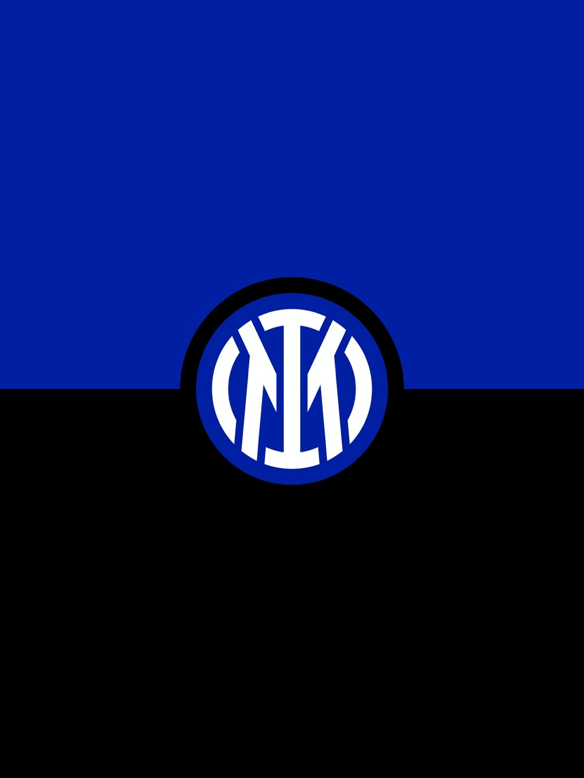
The new logo delves back into Inter Milan’s roots, described by the club as “a modern reinterpretation of the club’s historic symbol, in a more streamlined and minimalist guise”. This also makes it much more appropriate for use online and on-screen.
The I and M letters have been translated over from the original mark, created by graphic designer and illustrator Giorgio Muggiani – who was also a painter, caricaturist and, fittingly, a football referee. The two characters are framed in a circle, and coloured to match the original shades chosen for the club in 1908 – albeit dialled up to a more vivid hue.
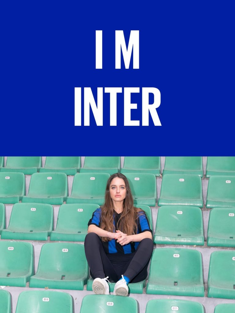
According to Inter Milan, the logo is also a play on ‘I am’, apparently in an effort to connect with a broader audience of nationalities and age groups, and reflect the identity of Milan itself.


Sceptics might feel like this is some unnecessary backwards rationalisation, particularly when the logo itself is strong enough to stand without too much added deeper meaning. It also gives rise to occasionally awkward brand-speak in some of the graphics introducing the new logo, as well as some frankly bizarre statements including ‘I M balls’, which, naturally, undermines the elegance of Bureau Borsche’s logo design.
Awkward I M/I am slogan aside, the update is certainly slick, and joins a growing group of businesses re-examining heritage logos and minimalising and flattening them to fit the demands of digital. Expect more to come.

