
Tech enthusiasts often laud Apple for its ability to reinvent products and designs for modern consumers. For example, this month, the Cupertino giant launched a modern-day version of the iMac, in seven eye-catching colors.
As a throwback, Apple is also hiding a retro screensaver in macOS that is reminiscent of the old ‘Hello’ display from circa Susan Kare.
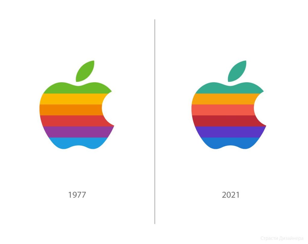
And judging by the new iMac ad, it looks like Apple has redesigned the classic rainbow Macintosh logo too. Launched all the way back in 1975, Apple’s rainbow logo is one of the most iconic emblems of all time. While fans would be glad to see it return this year, the colors appear a little different from the original.
According toCreative Bloq, instead of the bright and vibrant shades used in 1975, the updated logo is visibly darker and duller. The green, orange, and blue shades look markedly more muted.
However, it does seem that the new colors were edited to correspond with the seven colors of the new iMac.
Perhaps the original colors could still make a comeback?