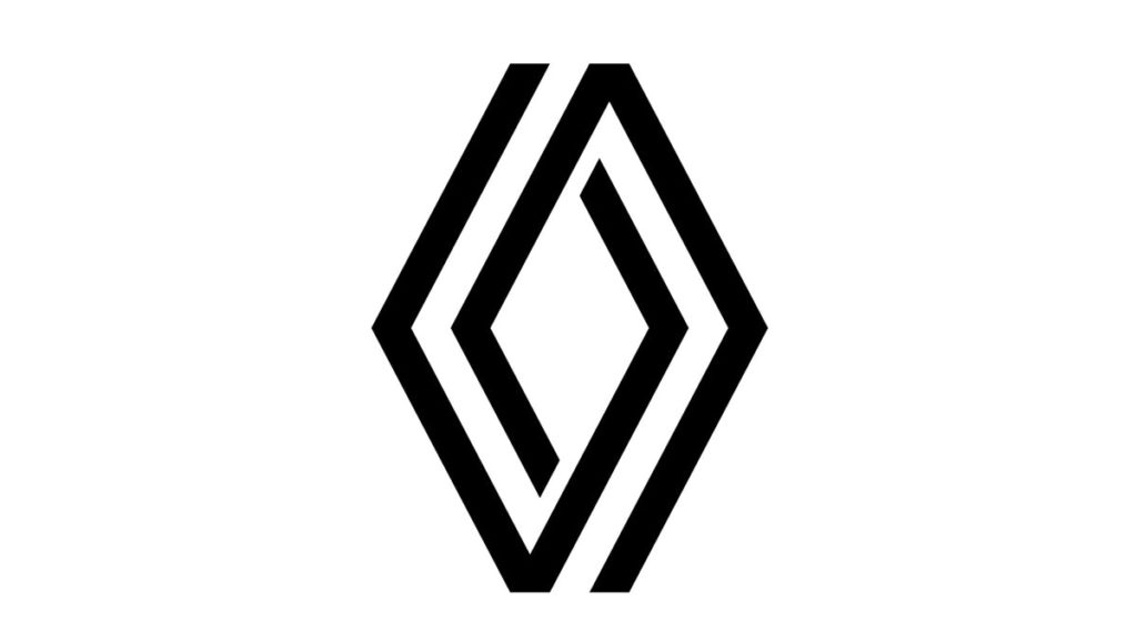
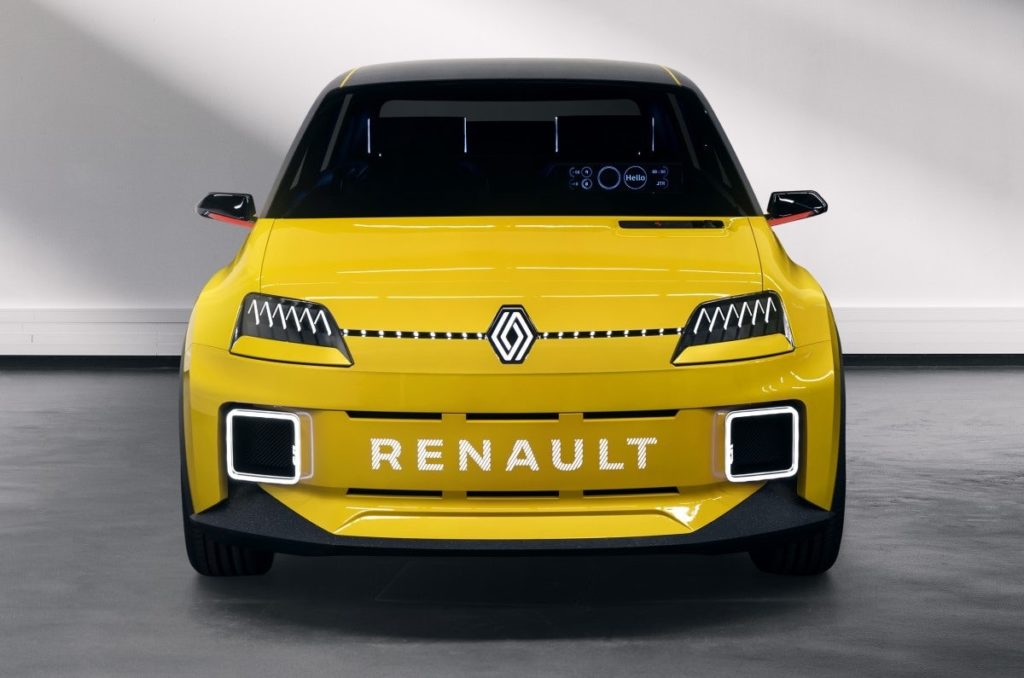
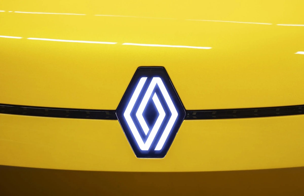
Joining a long list of car makers ‘digifying’ their visual identities, Renault has introduced a flat, black-and-white interlocking symbol that harks back to the 70s

Three-dimensional logos might work perfectly on car hoods, but plenty of automotive brands have discovered that doesn’t translate so well online. Companies including Volkswagen, Mini and Nissan have all flatified their symbols in recent years, and it’s not hard to see why.
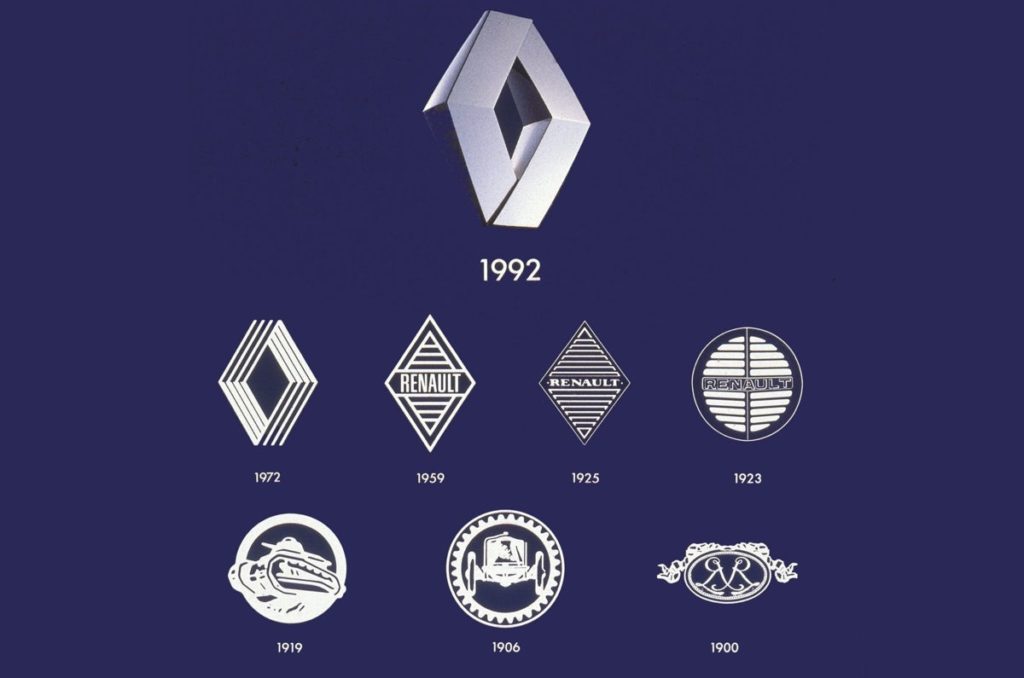
Renault is the latest to join the bunch, overhauling its existing 3D diamond – which dates back to 1992 – in favour of a geometric symbol that’s somewhat reminiscent of the much-loved Woolmark logo (considered by some to be the best logo of all time).
The work (described by the brand as a ‘Renaulution’) was done in-house, and is clearly designed with digital usage in mind. In a video discussing the new logo, Gilles Vidal, Renault’s design director, discusses that it was important to keep the diamond shape, which has been in existence in one form or another since 1925, while bringing in “fresh and new values for the future”. That said, the logo bears some resemblance to the brand’s 1972 mark, which also featured a set of interlinked stripes.


“Now it made sense to again go back to flat design, which is a thing of our times, and yet give it movement through the interaction of two diamond shapes looping one into the other to create movement, interaction, complementarity,” says Vidal, who emphasises that the flat logo is better suited for websites, apps, smartphones and screens inside cars.
The first model with the updated logo will appear in 2022, and by 2024 all Renault cars will bear the new symbol.

